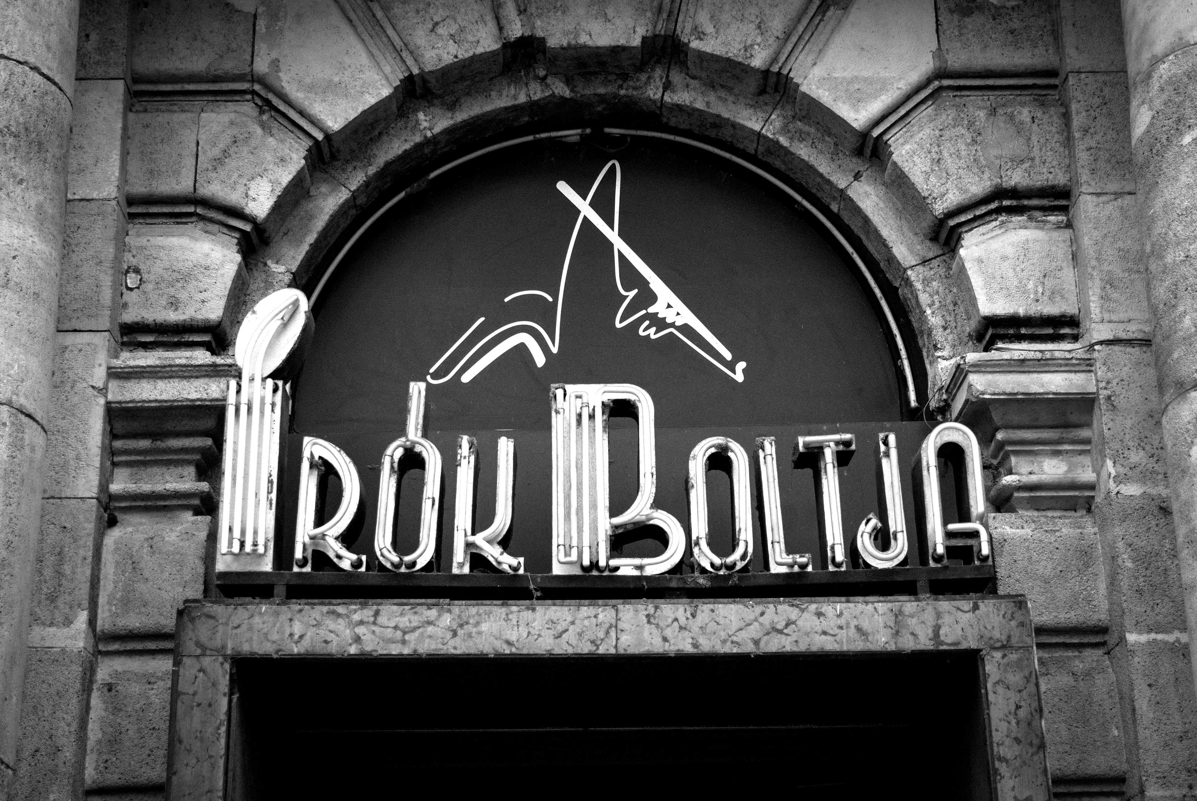
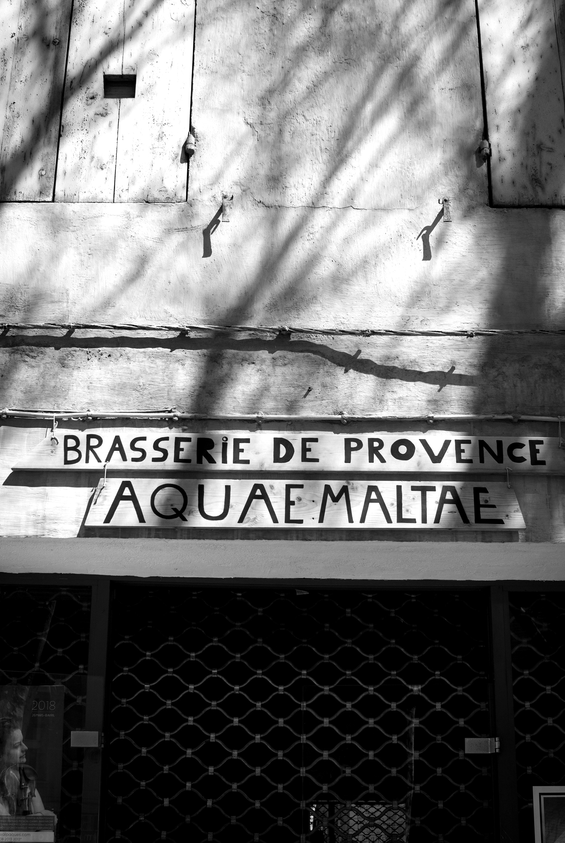
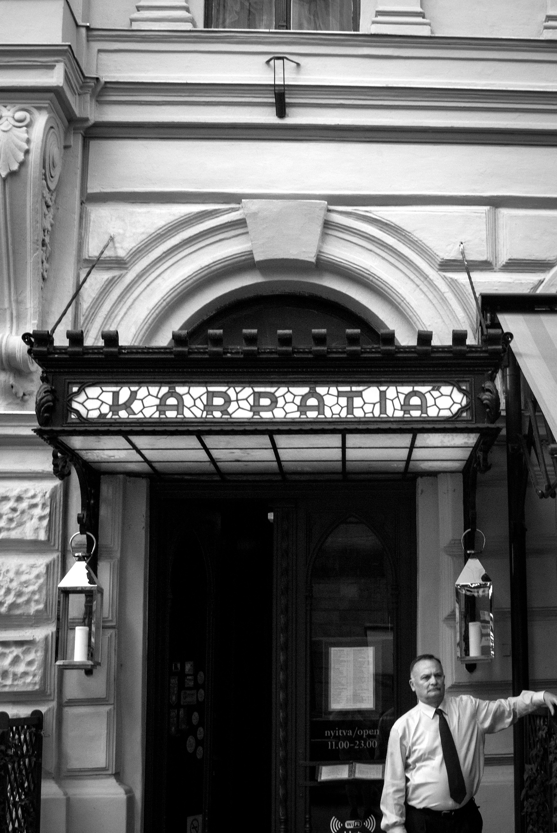
Across Europe, rich traditions of typographic sign-making are being replaced by ubiquitous typefaces such as Frutiger in a phenomenon known as Frutigerisation. This continuous replacement of local lettering styles in favour of uniformity and neutrality threatens to erase much of the vernacular character and variety from our towns and cities. Typographic signage forms a significant part of local visual heritage and this Frutigerisation ignores and subverts tradition and culture.
This project is a response to Frutigerisation, where Frutiger is injected with many of the vernacular characteristics that it often replaces. It is a celebration of character and variety in an increasingly standardised world, demonstrating the value of personality in contrast to total uniformity. That was Frutiger Then, this is Frutiger Now.
This project is a response to Frutigerisation, where Frutiger is injected with many of the vernacular characteristics that it often replaces. It is a celebration of character and variety in an increasingly standardised world, demonstrating the value of personality in contrast to total uniformity. That was Frutiger Then, this is Frutiger Now.


